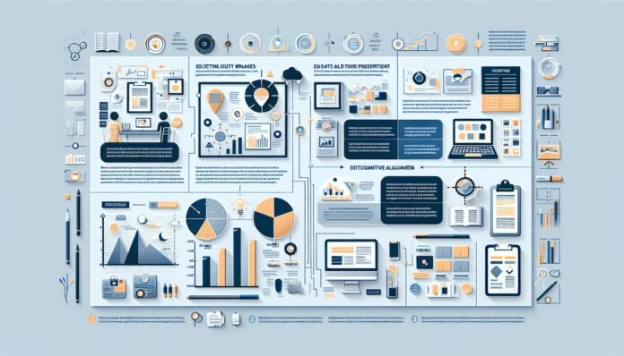
Visuals in professional writing enhance communication by making complex information clearer and more engaging. Studies show that visuals increase information retention by up to 65%, emphasizing their importance in effective writing. This post explores how to select, design, and integrate visuals like charts, graphs, and images into professional documents. It will also discuss aligning visuals with the content’s purpose and audience to ensure clarity and impact. Mastering this skill can elevate your writing, keeping readers informed and engaged.
Importance of Using Visuals in Professional Writing
Visuals hold a vital place in professional writing. They are not mere embellishments but crucial tools for conveying complex information succinctly. Whether crafting a report or a presentation, integrating visuals enhances communication, making the message more impactful. Here, we delve into the significance of using visuals in written content, exploring how they improve comprehension, retention, and engagement.
How Visuals Improve Reader Engagement and Comprehension
Visuals breathe life into dry text, capturing attention instantly. They break up blocks of text, adding variety to the reading experience. This visual stimulation encourages readers to stay engaged, reducing bounce rates significantly. A well-placed chart or infographic can elucidate complex data, simplifying the message for better understanding. Visuals also cater to different learning styles, appealing to visual learners who assimilate information more effectively through images than text alone.
The Role of Visuals in Enhancing Information Retention
Information presented visually is more likely to be remembered. Studies suggest that people recall 80% of what they see, compared to just 20% of what they read. Visuals create lasting impressions, aiding memory retention. Diagrams and charts help encode information in the brain, making it easier to retrieve later. This retention is crucial for professional settings, where the recall of data and insights can influence decision-making and productivity.
Common Challenges When Incorporating Visuals into Documents
Incorporating visuals is not without challenges. The selection of appropriate visuals that align with the content can be daunting. Misaligned visuals may confuse rather than clarify, disrupting the flow of information. Technical limitations, such as file sizes and formats, can also pose hurdles. There’s a fine balance between enhancing content and overwhelming the reader with too many graphics. Navigating these challenges is key to effective communication in professional writing.
Selecting and Designing Effective Visuals for Professional Documents
Choosing and designing the right visuals is an art and science. It requires a strategic approach to ensure that visuals support and enhance the document’s purpose. This section explores the nuances of selecting appropriate visual aids and crafting them with clarity and visual appeal.
Choosing the Right Type of Visual: Charts, Graphs, and Infographics
Different types of visuals serve different purposes. Charts are ideal for presenting numerical data, while graphs can depict trends and relationships. Infographics, on the other hand, combine text and imagery to narrate a story or convey a message. Selecting the right visual depends on the data and the audience’s needs. A well-chosen visual can transform complex information into an easily digestible format, aligning with the document’s objectives.
Best Practices for Designing Clear and Visually Appealing Graphics
Designing effective visuals requires attention to detail. Clarity and simplicity should guide the design process. Use contrasting colors to highlight important data points, and ensure text is legible. Consistent design elements, such as fonts and color schemes, create a cohesive look. Visual hierarchy is crucial; guide the viewer’s eye to the most critical information first. Incorporating these best practices enhances the visual’s effectiveness and professionalism.
Avoiding Common Mistakes When Creating Visual Aids
Common pitfalls can diminish the impact of visual aids. Overloading visuals with information can lead to confusion. Keep the message clear and concise, avoiding unnecessary embellishments. Ensure accuracy in data representation to maintain credibility. Poor quality images or graphics can detract from the document’s professionalism. Avoid these mistakes to create visuals that enhance rather than detract from the content.
Integrating Visuals Seamlessly into Professional Content
The seamless integration of visuals into text is crucial for maintaining coherence. Effective integration involves aligning visuals with the document’s goals and ensuring they resonate with the target audience. Let’s explore strategies for embedding visuals into professional content to optimize their impact.
Tips for Aligning Visuals with the Document’s Purpose and Audience
Understanding the document’s purpose and the audience’s needs is paramount when integrating visuals. Tailor visuals to complement the message and resonate with the reader. Consider demographic factors that may influence how visuals are perceived. Use visuals to reinforce points and convey emotions or concepts that text alone cannot capture. Ensuring alignment enhances the message’s clarity and effectiveness.
How to Effectively Label and Reference Visuals in Text
Effective labeling and referencing are essential for clarity. Each visual should have a descriptive title and, where necessary, a legend that explains symbols or colors. In the text, refer to visuals by their titles or numbers to direct the reader’s attention appropriately. This practice provides context and facilitates understanding, ensuring the reader can easily correlate text with visuals.
Formatting and Placement Techniques for Optimal Presentation
Proper formatting and placement enhance a visual’s impact. Position visuals near the relevant text to maintain flow and coherence. Ensure ample white space around visuals to prevent clutter. Consider the document’s layout and how visuals can complement it without overpowering the text. These strategies contribute to a polished and professional presentation, making the document more engaging and accessible.
Conclusion
Get Visuals are essential in professional writing for improving comprehension, engagement, and retention. They simplify complex information, cater to visual learners, and make content more memorable. Challenges in using visuals include selecting appropriate graphics, avoiding information overload, and ensuring technical compatibility. Effective visuals require clarity, simplicity, consistent design, and accurate data representation. Seamless integration involves aligning visuals with the document’s goals, proper labeling, referencing, and strategic placement for optimal impact.
Why are visuals important in professional writing?
Visuals play a crucial role in professional writing as they attract attention, clarify complex ideas, and break up text. They help convey information quickly and effectively, making it easier for readers to grasp key points.
How do visuals enhance content readability and comprehension?
Visuals improve readability by breaking up long blocks of text, making content more digestible. They aid comprehension by illustrating concepts, highlighting important data, and providing context, ultimately making information more accessible to diverse audiences.
What types of visuals work best for professional documents?
Charts, graphs, infographics, and diagrams often work best for professional documents. These visuals offer clear, concise representations of data and concepts, making it easier for readers to understand complex information.
How can you effectively integrate visuals into business communication?
Integrating visuals effectively requires aligning them with your main message and ensuring they complement the text. Use visuals consistently across platforms, maintain high quality, and include captions or labels for clarity.
What are common mistakes to avoid when using visuals in writing?
Avoid overloading your document with visuals, which can overwhelm readers. Ensure visuals are relevant and of high quality. Steer clear of using complex visuals without explanation, and refrain from relying solely on visuals to convey your message.
How do well-designed visuals impact audience engagement?
Well-designed visuals capture attention and hold interest, encouraging readers to interact with the content. They enhance engagement by making information more relatable and memorable, which can lead to increased understanding and retention.


